Tech Tip – Putting iPadOS 17 to Work For You
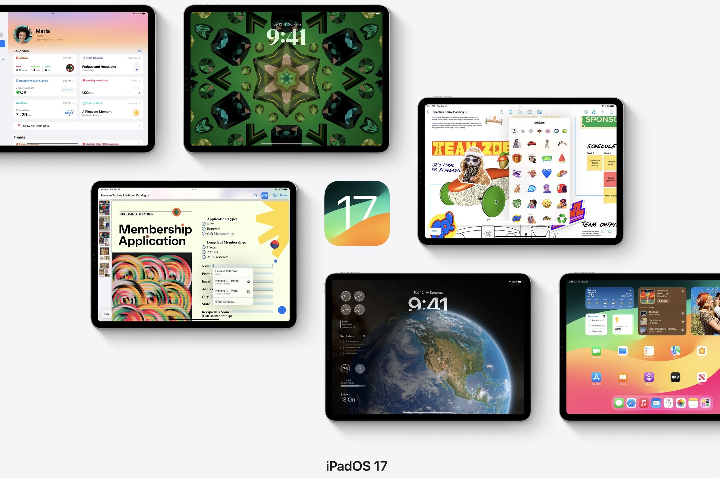
Apple, as usual, updated all their primary operating systems in September. This year, unlike the last couple, both iOS and iPadOS were released at the same time in mid-September. Everything that is new in iOS17 becomes available in the iPad version, but the iPadOS has features unique only to the iPad. If you read other articles or watch YouTube videos on both, you’ll hear that most of the comments center around this being a “quality of life” update cycle. I agree. But several are welcomed, and frankly, overdue changes that will be beneficial to most users. Those are the ones I will concentrate on in this article.
Making our devices more functional and productive for us is the desire every year. Rarely do I find myself hoping for wildly new features never thought of before; rather, I am searching for simple changes that will allow me to use my devices in a way that helps me most. I think we got many of those this year. Some, I am still exploring. Here I will cover some of the most useful updates that were made, and in most cases, I have already put them into use, which means they did add value in a way I was hoping this year.
Top on my list is to have interactive widgets.
Interactive Widgets
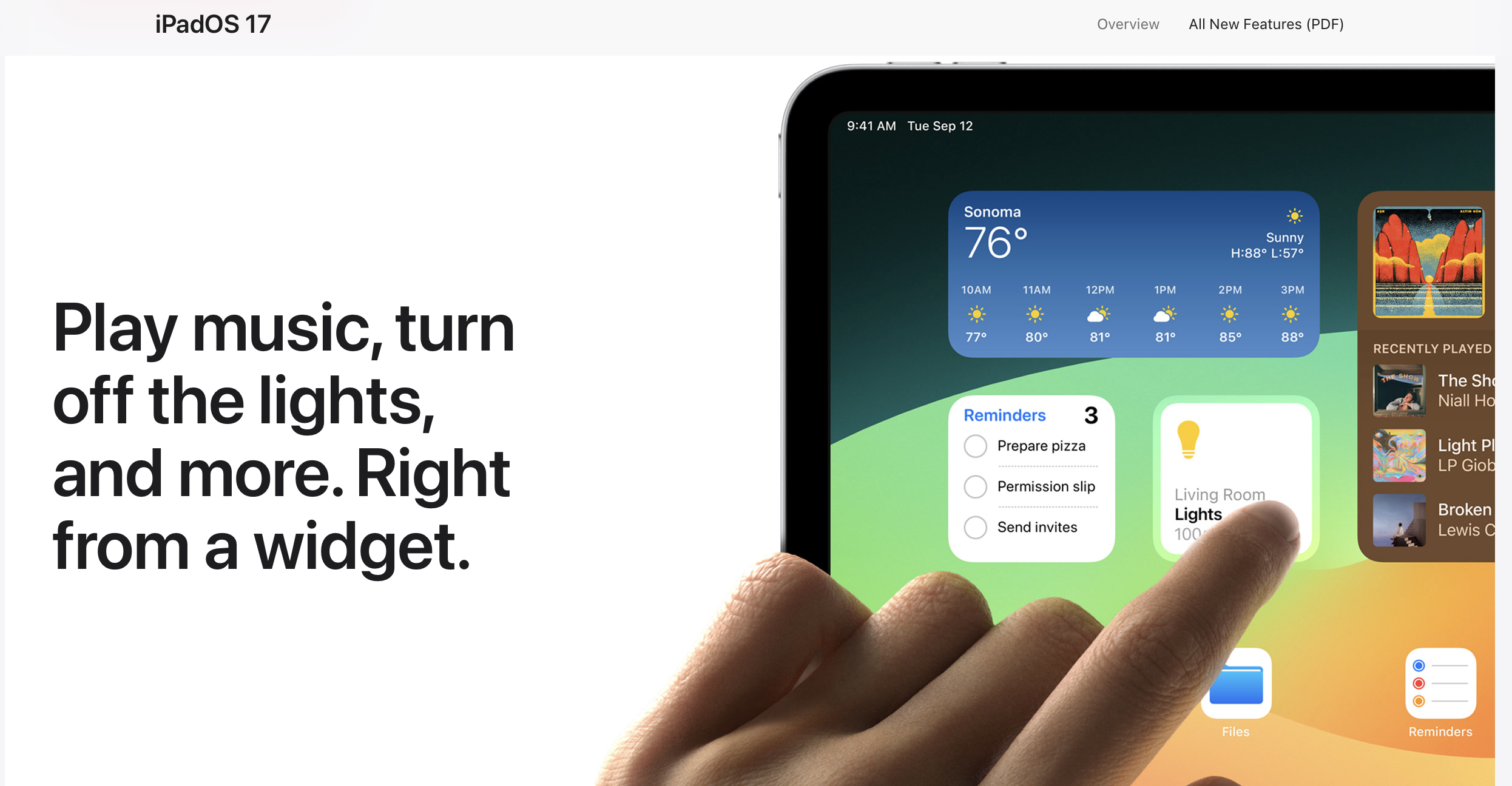
Apple introduced widgets to the iPhone two years ago. Last year, they came to the iPad. However, there were basically static displays that showed more information, but was still only a link to opening the application.
This year, on both iPhone and iPad, we got the update we all wanted and can now DO stuff with those widgets. If you have a checklist, you can actually make them as complete without opening the full application. Very handy. The other widget this works well for is the Apple Home app for controlling smart home devices. Need to turn a light on quickly, now you can right from the widget. I am certain there are other great examples of putting this update to good use, but those two alone make it worth it for me and many others.
New Lock Screen and Widgets
When first approaching your iPad, you have this huge screen that largely goes unused. Sure, you see recent notifications, but apart from the time, there wasn’t much else you could have there. Now, you can have widgets (also interactive) and customize the look much more than you could in the past. This is a quality of life upgrade in the best sense. It just makes the iPad a little more friendly and functional at the same time.
Making the iPad Lock Screen look the way you want with many new options is a nice to have feature, but it is only that: nice to have. Seeing some key data points via widgets is great at a glance. Being able to toggle things as done or jump right into those applications from the Lock Screen is very useful.
Linking Notes
The Apple Notes application continues to get better each year. There is no shortage of different notes applications for the iPad. Several have been introduced in the last few years, getting more and more sophisticated. These are largely for advanced users with specific needs. I am always intrigued by them, but have not jumped into that space just yet. (For your curiosity, I am thinking of applications like Notion, Obsidian, Roam Research, or Bear.) These applications are labelled more as personal knowledge management applications than notes, but they are designed to capture many types of media, just like Apple Notes.
The thing with Apple Notes is built in, works with nearly everything, and is free. Plus, you have the peace of mind that it will be there as long as Apple is, since they make it.
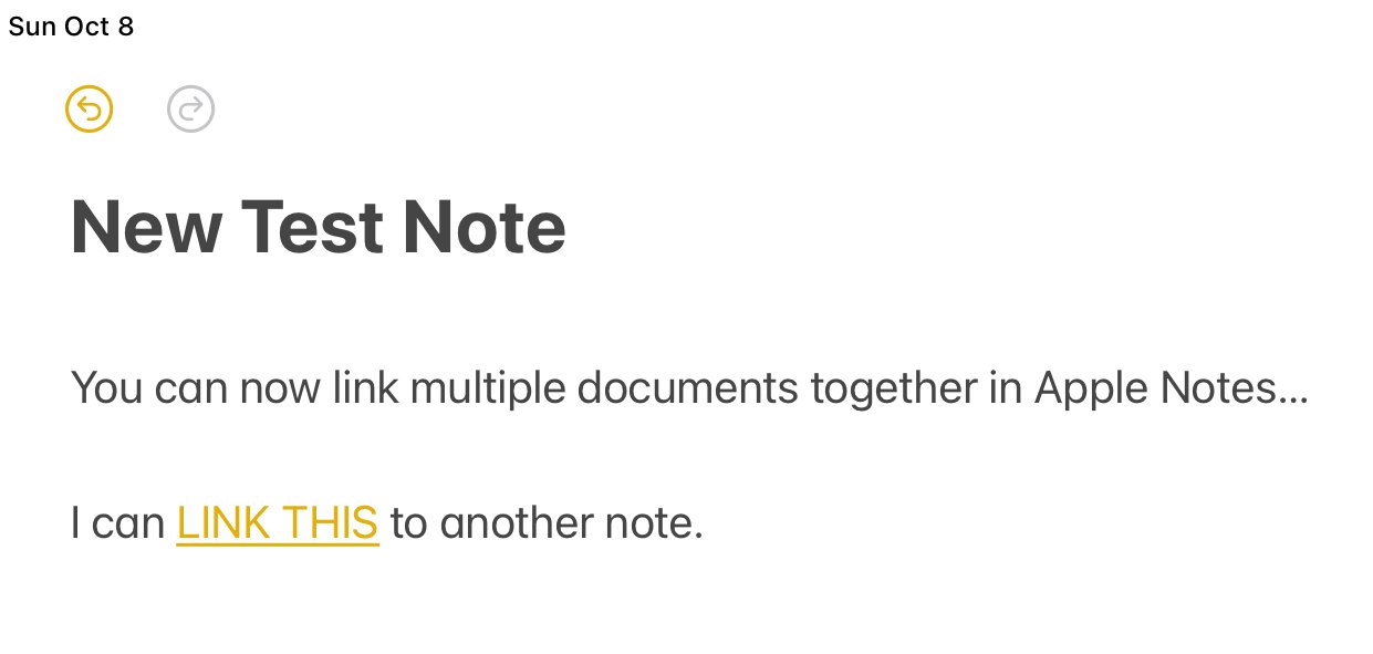
With note linking, you now have the ability to connect documents together. Previously, you could bring an outside link into Apple Notes and jump right to that website, or cloud document, but you could not connect to another Apple Note. (Technically, it was possible, but there were a lot of hoops to jump through to make that happen.) Now, you can just highlight what you want to link, it will bring up a note search and you can connect the two documents.
In this example, I can select the ‘this link’ to another document. I can choose from a list of other Apple Notes, or an outside URL. I’ll type ‘goals’ to search for a note on goals. Using the 2023 Goals note, I can now link that from this note to that page. It creates the normal hyperlink, and when tapped, it will take me directly to that note.
I see this as being especially handy for creating an interactive table of contents for groups of notes you have. That will also allow you to create a ‘back link’ to the table of contents to navigate through a series of documents.
Hopefully in the future, Apple will add the ability to automatically create a ‘back link’ to the note that brought you to the new note. That would allow for an open loop system to navigate to and from other documents easily.
Apple Health App
This one may seem both a little silly and cause you to ask, “wait, it wasn’t on the iPad before?” No. Actually, it was not. Having Health on the iPad is nice to use the extra screen real estate to see so much more information at one time. It functions like a personal health dashboard. It may not be an everyday thing, but throughout the week I enjoy looking at all the health data I have in a much easier to see format.
Self-care and health awareness is an important topic, and I like that Apple is making this more visible and available to users by bringing this to the iPad. The work they are doing with the Apple Watch and connecting information to other applications will only benefit users. Being able to see more of that data in one place at one time is a huge help.
PDF Markup
Being able to make notes and mark up a PDF is not new to an iPad, but being able to do so within the Notes app and keep those annotations is. This is a big win and further builds the value of the Apple Notes application. The ability to manage and work with PDFs in Notes makes it much easier to do everything all in one place. And, considering you can share and collaborate from Notes that helps as well.
Everyone’s use case while working with PDFs is a little different. You may only need to consume and review PDF documents, but even that is better with iPadOS 17. You can see full size PDF documents from Notes and flip through them seamlessly now. I certainly see this as a big win, and it should eliminate the need for me to maintain another PDF only application. Time will tell if it fully eliminates this need, but early testing indicates that it will. I am still playing with both Notes and using PDFs in GoodNotes, but either still eliminates the need for a third application.
The only downside I see so far is that it's a little buggy. I have had issues with the annotations saving correctly in Apple Notes, then not being able to access them again without jumping to a different note and then back. I will report back on this in a future article, and possibly go more in depth on this feature for Apple Notes.
Reminders
Reminders is another stock application that continues to get small improvements each year. Reminders is on the edge of being a fully capable task manager for almost any, but the most advanced cases. I intend to explore this further in the coming months to see if it can become a replacement for my current choice of Todoist.
This year, Reminders received two updates that continue to push it forward. The first is the ability to see lists in a column view. This makes Reminders look and feel like a Kanban board style application. This is great for basic project management and seeing things in a card style view. In the sample below you can see a simple list with sections for ‘backlog’, ‘in progress’, and ‘completed’. You can then move the cards from section to section in the column view. This works by reassigning the sections within the task, or drag and drop. It is very handy. This would also be an excellent way to track by person instead of status.
The other new feature is creating a grocery list that reminders automatically sorts by area of the store. It essentially creates sections for you based on machine learning (also read: Artificial Intelligence). This works well from what I have seen. Since it is also easy to share notes between people, this may be the new best way to have a family shopping list that makes it easy for anyone to find what is needed when they are at the store.
There are several other updates and enhancements that Apple made with this year’s version of IOS and iPadOS. I’ve covered the most useful that I have found so far. As I get further into the year, I’ll share other new features that may become significant functional improvements. One where my jury is still out is Stage Manager. Since I tend to use my iPad is a more focused way, I do not work between multiple apps at the same time, or switch between groups of apps. I am uncertain if it offers the same benefits it may for others. However, I do want to dive deeper into it. Numerous enhancements have been made this year, and many users of Stage Manager have said the updates this year make it much better than the version one we received last year. That will be another thing I report back on in the coming months.
In the meantime, make sure you have updated to the latest iPadOS, both for features and the security updates that always come along with software updates. I think this year’s changes do make the iPad a better productivity tool for any retail leader.
What are your favorite new features in iPadOS 17?
Join other retail leaders in continuing their development journey with Effective Retail Leader.com. SUBSCRIBE today to receive leadership tips directly to your inbox and monthly newsletters that provide many tools to help further develop your leadership skills. JOIN NOW!


